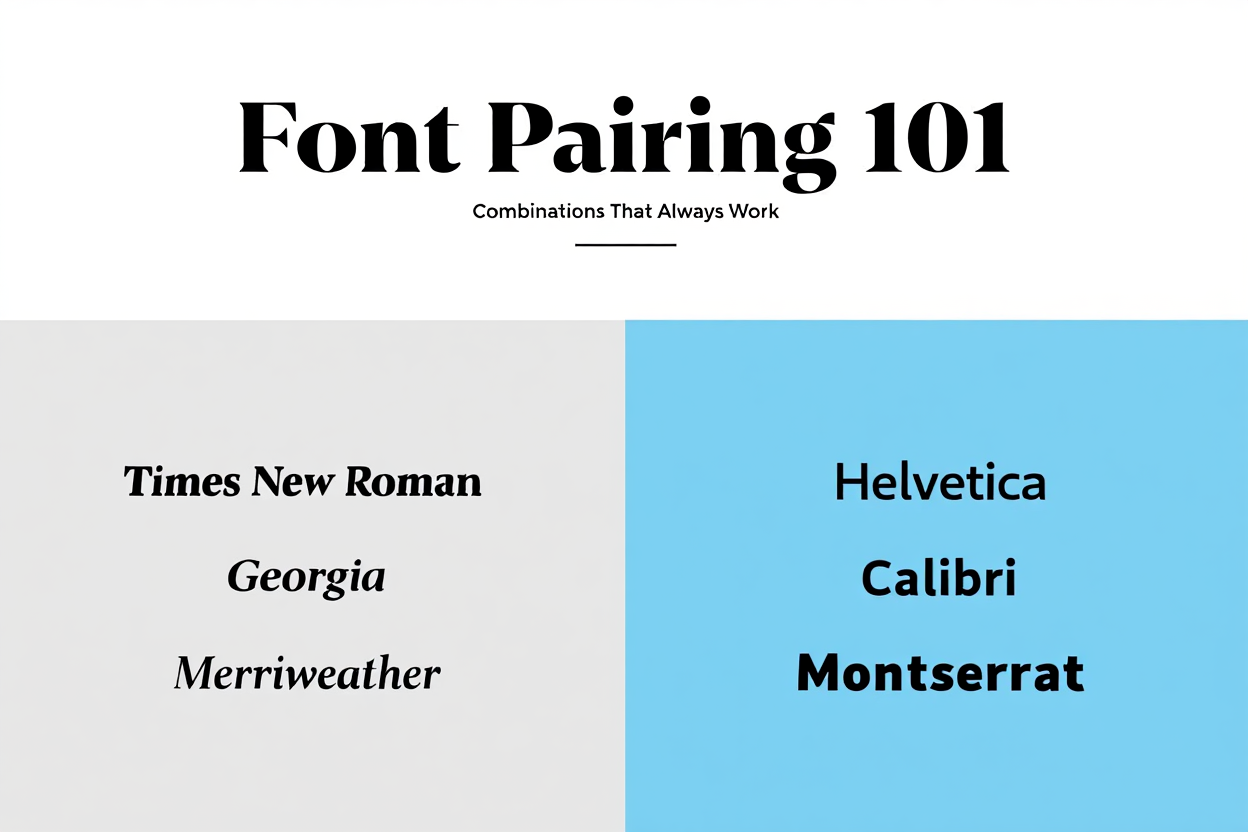
Choosing fonts is like choosing outfits — one wrong match can throw off your entire look, while the right combination creates instant style. For designers, marketers, and brand owners, font pairing is a crucial skill that can make your projects feel polished and professional.
In this guide, we’ll break down the essentials of font pairing and share timeless combinations that just work — every single time.
Why Font Pairing Matters
Fonts are more than just letters on a screen; they communicate mood, style, and personality. The right pairing can:
- Guide the reader’s eye through your content
- Establish brand personality (serious, playful, elegant, minimal)
- Improve readability across devices
- Create visual harmony
When fonts clash, your audience might not know why they feel “off” — but they’ll notice.
The Basics of Font Pairing
Before we jump into combinations, here are three golden rules:
- Contrast is Key Combine fonts with different visual qualities. For example, pair a bold, modern sans serif with a classic serif for balance.
- Limit Your Palette Stick to two (maximum three) fonts in one design. This keeps your layout clean and easy to read.
- Define Roles Assign each font a purpose — headline, subhead, body text. Avoid fonts competing for the same role.
Font Pairing Styles That Always Work
1. Classic Serif + Clean Sans Serif
- Example: Playfair Display (headline) + Lato (body)
- Why it works: The elegance of a serif paired with the modern feel of a sans serif creates a timeless balance.
2. Bold Sans Serif + Light Sans Serif
- Example: Montserrat Bold (headline) + Open Sans Light (body)
- Why it works: Using two weights from different sans serif families adds contrast while staying cohesive.
3. Handwritten Script + Minimal Sans Serif
- Example: Pacifico (headline) + Roboto (body)
- Why it works: Script fonts bring personality, while a neutral sans serif keeps the content readable.
4. Modern Serif + Humanist Sans Serif
- Example: Merriweather (headline) + Gill Sans (body)
- Why it works: This pairing blends sophistication with approachability, perfect for editorial and branding.
5. Display Font + Simple Sans Serif
- Example: Bebas Neue (headline) + Source Sans Pro (body)
- Why it works: Eye-catching display fonts need a calm partner — and a simple sans serif does the job.
Tips for Testing Your Pairings
- Print it out — Fonts can look different on paper versus screen.
- Test in real context — See your pairing on a website mockup, social post, or brochure.
- Mind accessibility — Ensure enough contrast for readability, especially for body text.
Where to Find Perfect Fonts
If you want ready-to-use, professionally paired fonts, check out our fonts marketplace — curated by designers, tested for readability, and ready for your next project.
From bold display sets to elegant scripts, you’ll find combinations that work across web, print, and branding.
Final Takeaway
Great font pairing is a balance of contrast, harmony, and purpose. By mixing different font families thoughtfully and keeping your design roles clear, you can elevate any project from “nice” to “memorable.”


A WordPress Commenter
Hi, this is a comment.
To get started with moderating, editing, and deleting comments, please visit the Comments screen in the dashboard.
Commenter avatars come from Gravatar.