
Your website could have the most beautiful design and compelling content in the world — but if your visitors struggle to read it, they’ll click away in seconds.
That’s where typography comes in.
The right fonts don’t just make your site look good — they make it easy to consume information, guide your readers smoothly, and create a professional impression.
Let’s explore how to use fonts strategically to make your website both beautiful and readable.
Why Readability Matters
- Better user experience → Visitors stay longer and engage more
- Higher conversion rates → People actually read your message
- Accessibility → Everyone, including those with vision challenges, can navigate your content
Typography is not decoration — it’s communication.
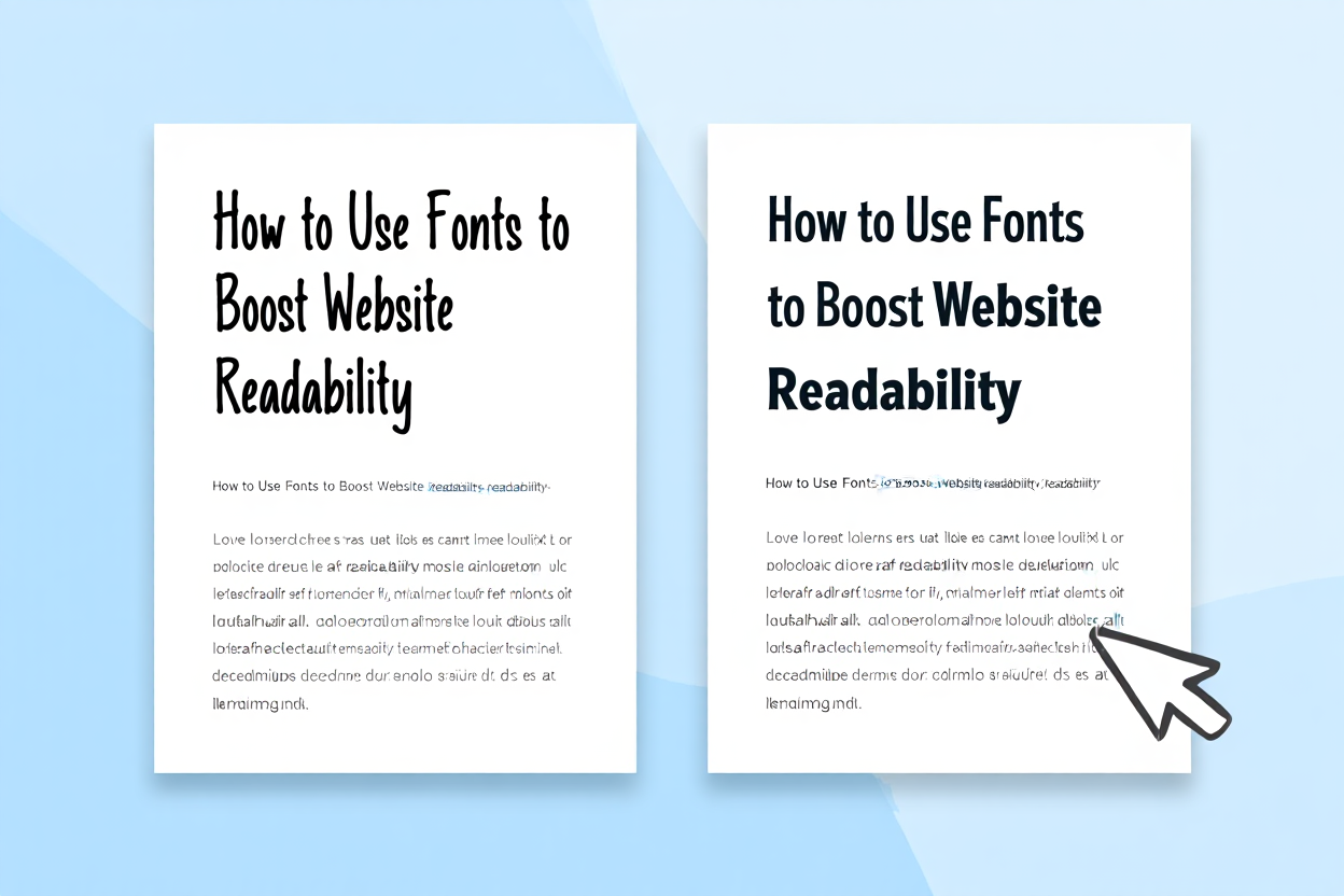
1. Choose Fonts Designed for Screen Reading
Some fonts are beautiful in print but hard to read on a screen. When selecting website fonts, look for:
- Clear letterforms (no overly decorative flourishes in body text)
- Generous spacing between characters
- Open shapes for letters like “a,” “e,” and “o”
Examples: Lato, Open Sans, Roboto, Inter
2. Pick the Right Font Size
Too small = squinting and frustration.
Too large = overwhelming and awkward.
Guideline:
- Body text: 16–18px for desktop, slightly smaller for mobile
- Headings: Scaled proportionally (about 1.5–2x the body text size)
Always check your site on multiple devices to ensure comfort.
3. Maintain Strong Contrast
Black text on a white background is classic for a reason — it’s easy to read.
Low-contrast combinations (like light gray on white) may look sleek but cause eye strain.
Rule of thumb: WCAG recommends a minimum contrast ratio of 4.5:1 for normal text.
4. Limit the Number of Fonts
Too many fonts can make your site feel messy and confusing.
Stick to:
- One font for headings
- One font for body text
- Optional: a third accent font for special elements
Pro tip: Use font weights and styles (bold, italic) to create variety without adding extra typefaces.
5. Use Proper Line Spacing & Width
- Line height (leading): About 1.4–1.6x the font size for comfortable reading.
- Line length: Aim for 50–75 characters per line — wide lines are tiring to read, narrow lines feel choppy.
6. Test for Accessibility
Readability isn’t just for aesthetics — it’s an accessibility requirement.
Test your fonts with tools like:
- WebAIM Contrast Checker
- Google Lighthouse accessibility audit
7. Match Fonts to Your Brand Personality
Readability is essential, but your font should also reflect your brand.
For example:
- Modern tech startup → clean, geometric sans serif
- Creative studio → playful handwritten font for headlines, clean sans serif for body text
- Luxury brand → elegant serif for headings, light sans serif for body text
Where to Find Web-Ready Fonts
Fontify Marketplace features curated fonts optimized for screen readability.
You’ll find everything from elegant serifs to versatile sans serifs — all tested for clarity, accessibility, and performance on modern devices.
Final Takeaway
Boosting website readability isn’t complicated — it’s about making thoughtful choices:
✅ Pick web-friendly fonts
✅ Size them for comfort
✅ Ensure high contrast
✅ Keep layouts clean and consistent
Do it right, and your visitors won’t just read your content — they’ll remember it.
Leave a Reply